Advertisement
THIS POLL HAS ENDED! Thank you to everyone who voted! This survey has ended! Thanks to everyone who voted! I have ended the survey a few hours early. Option A was the clear winner by about a 3:1 vote!
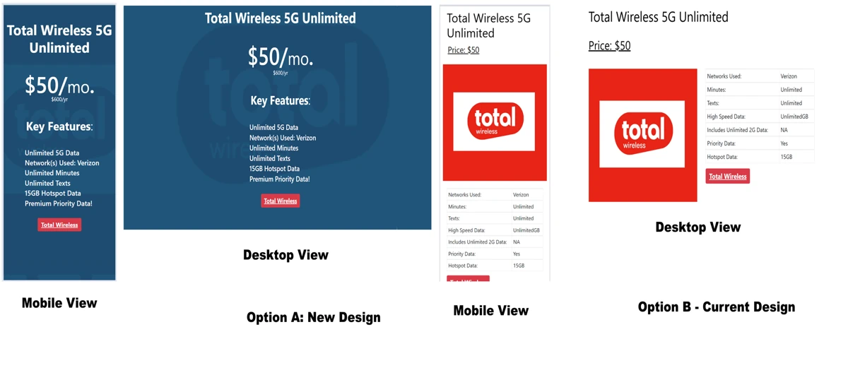
I need your help! I'm considering a design change to the individual phone plan pages on the website. There are 2 options, the original design and the new design. Please vote on which one you like best via the attached survey link. Thank you.
In case you can't see the form below to place your vote, the link to the voting form is here:

I like the higher contrast of text vs. background of the current design, which improves readability for older eyes like mine, especially in low-light conditions.